New
DAVID
Id
2022 —
brand identity —
graphic design —
illustration —
corporate id —
brand identity —
graphic design —
illustration —
corporate id —
︎︎︎
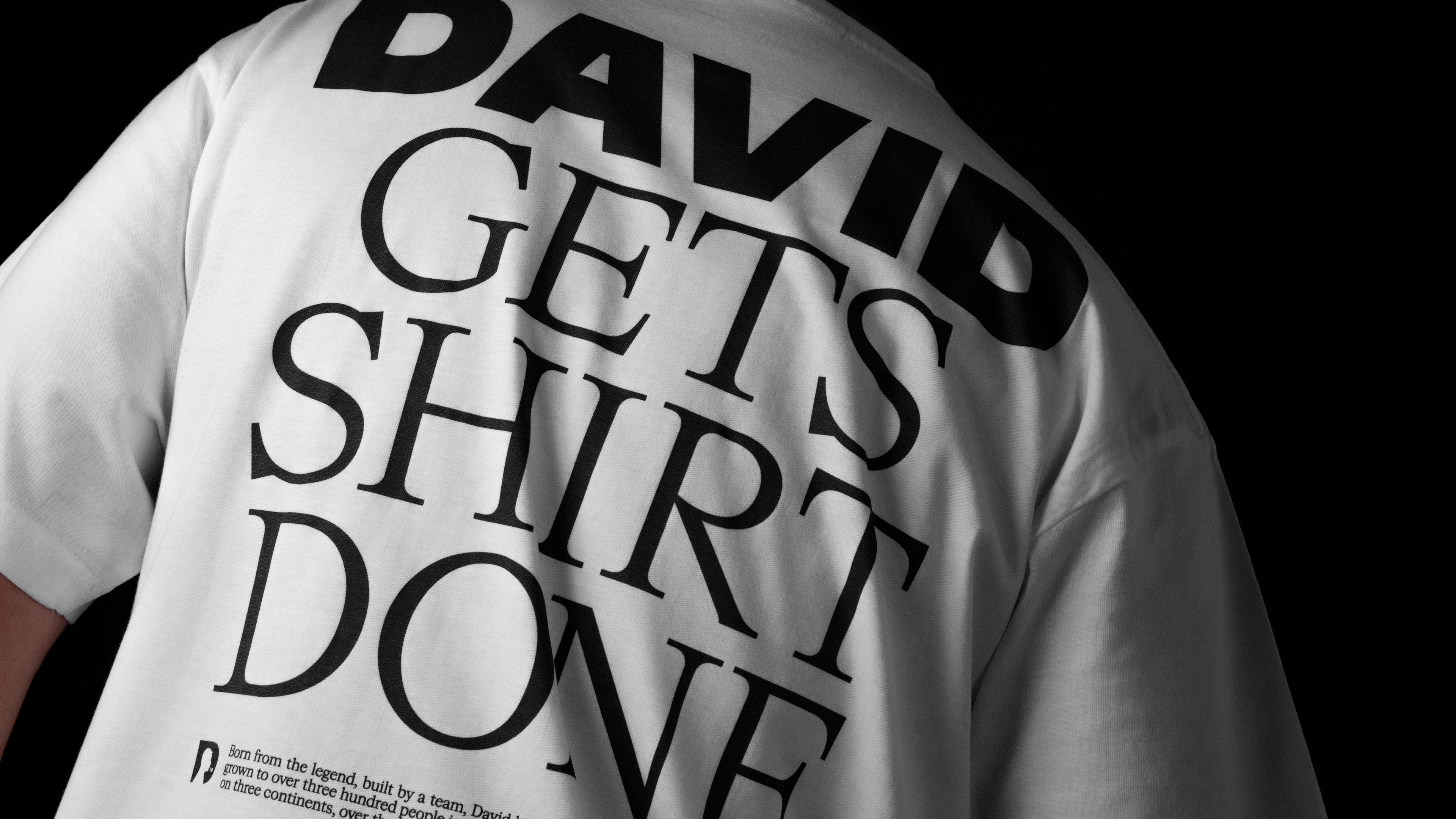
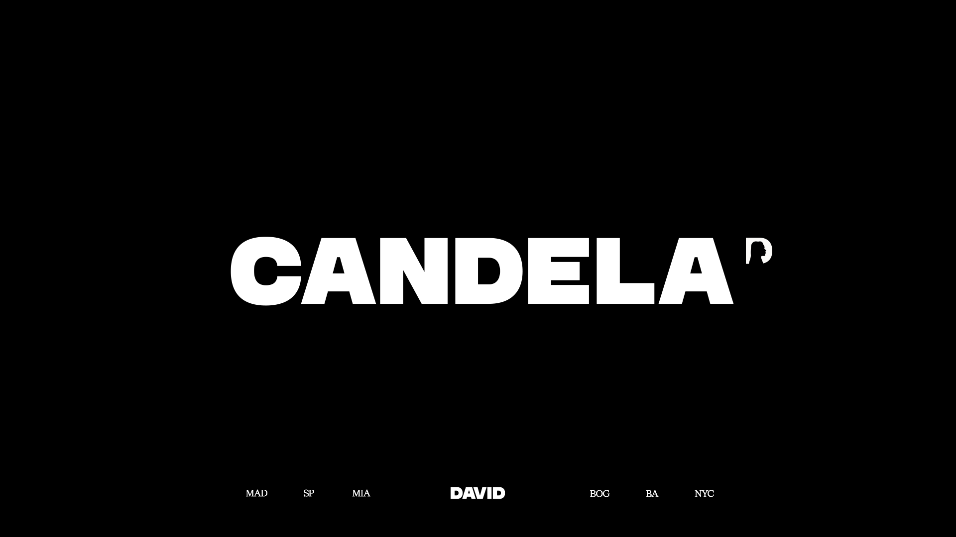
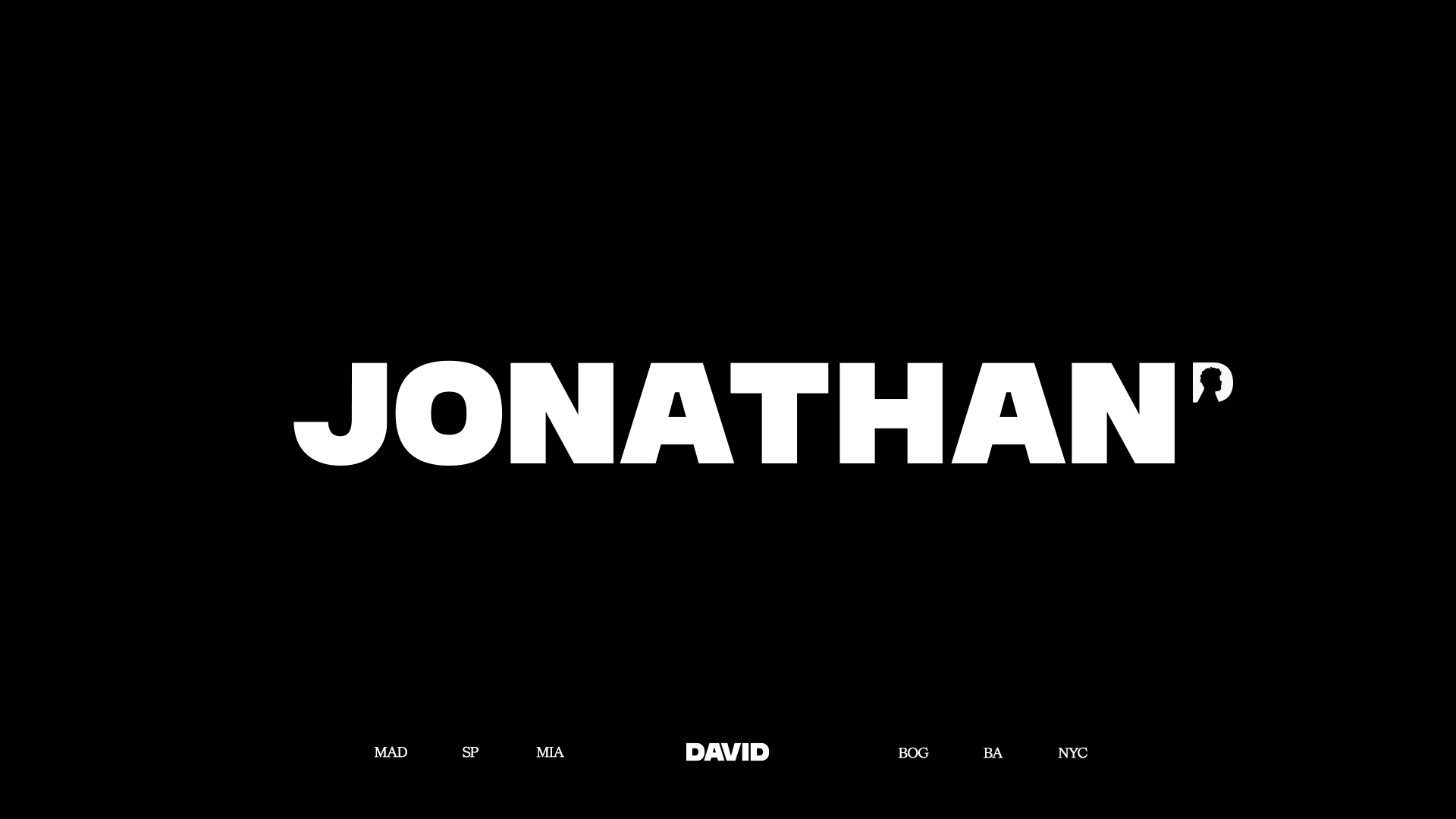
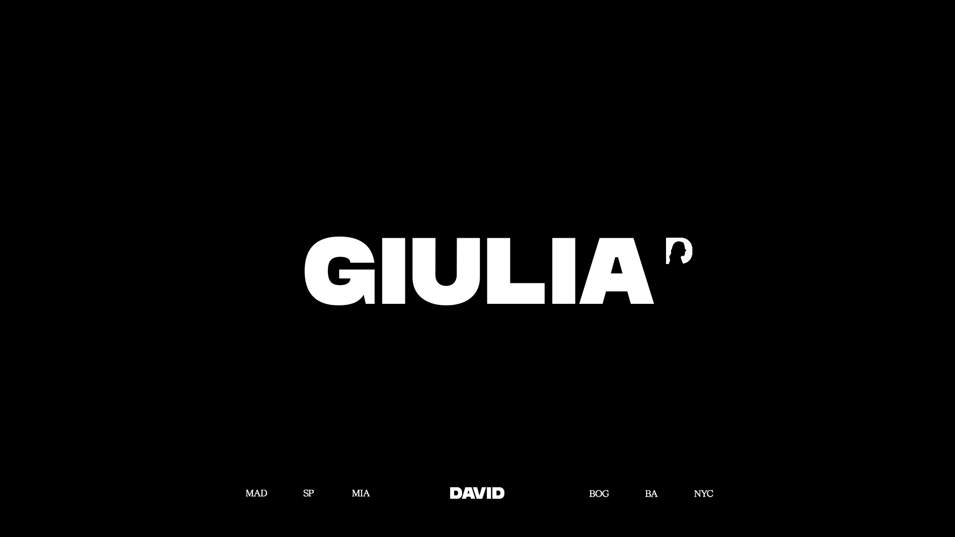
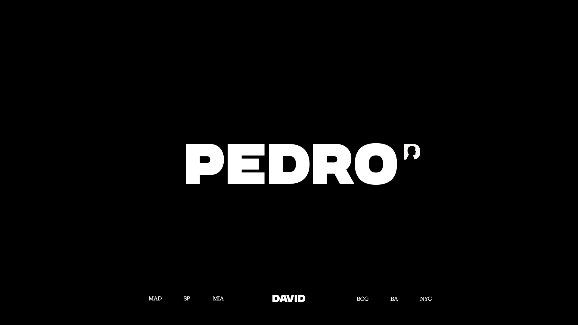
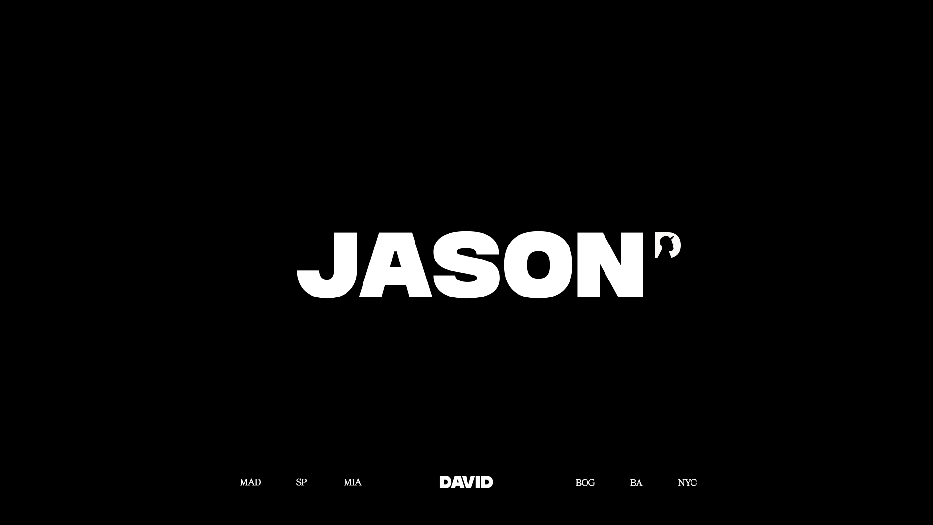
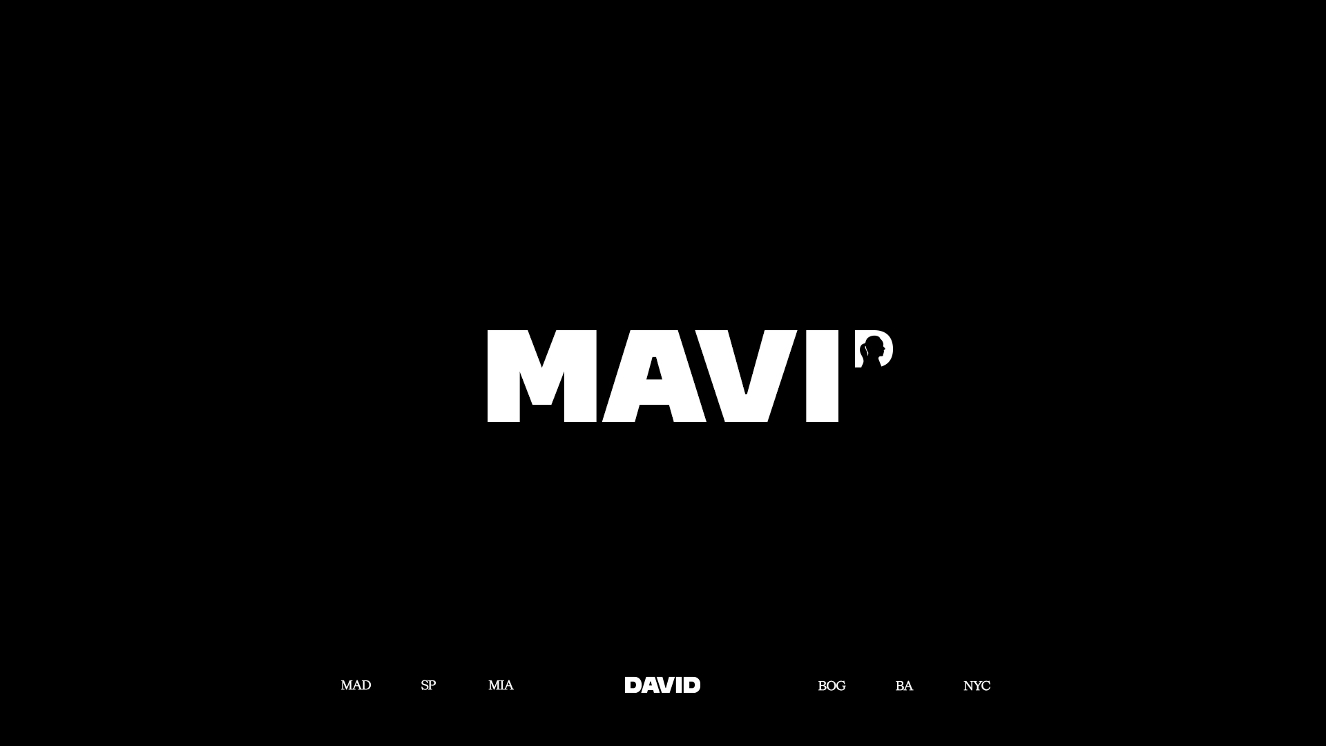
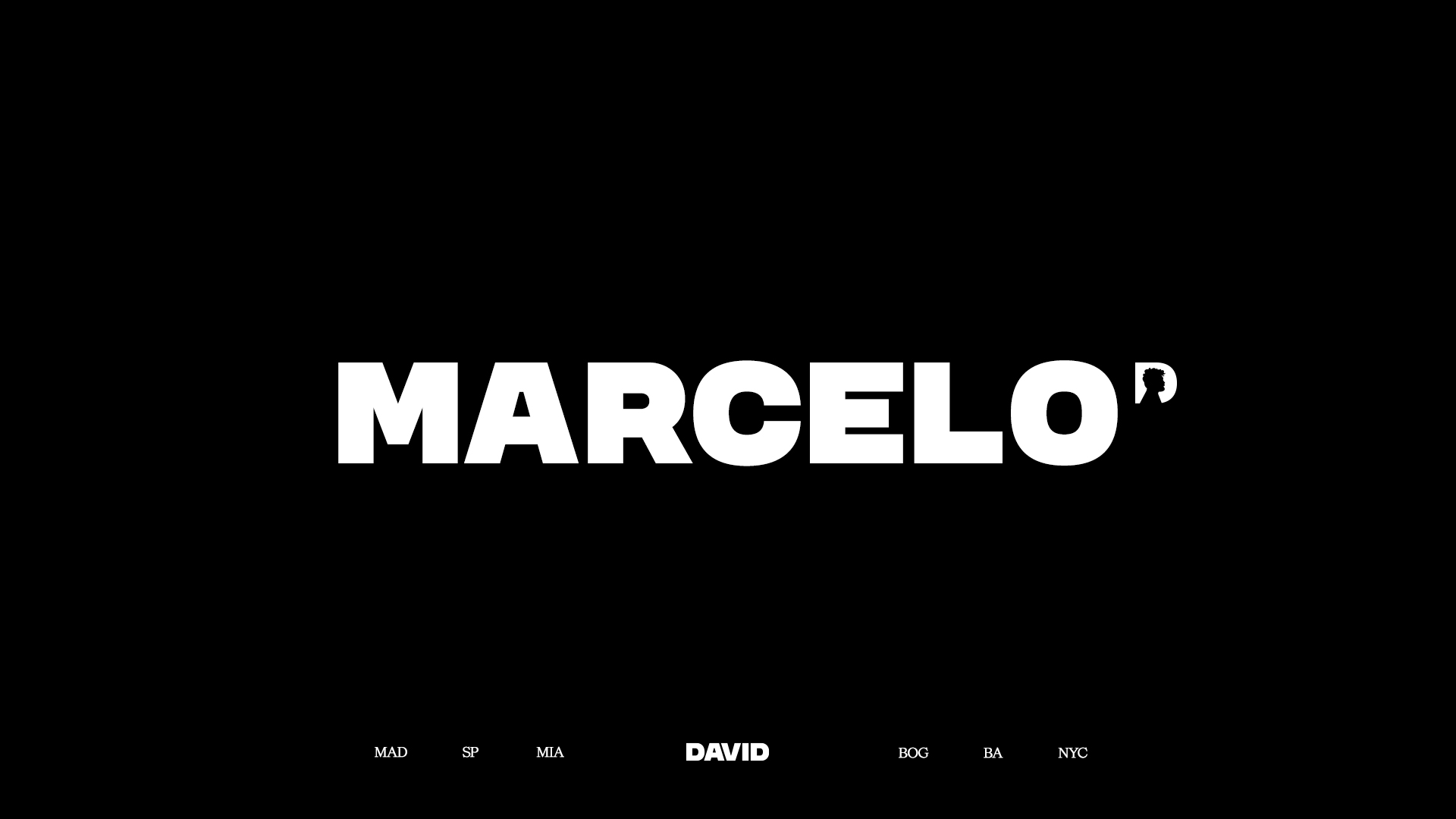
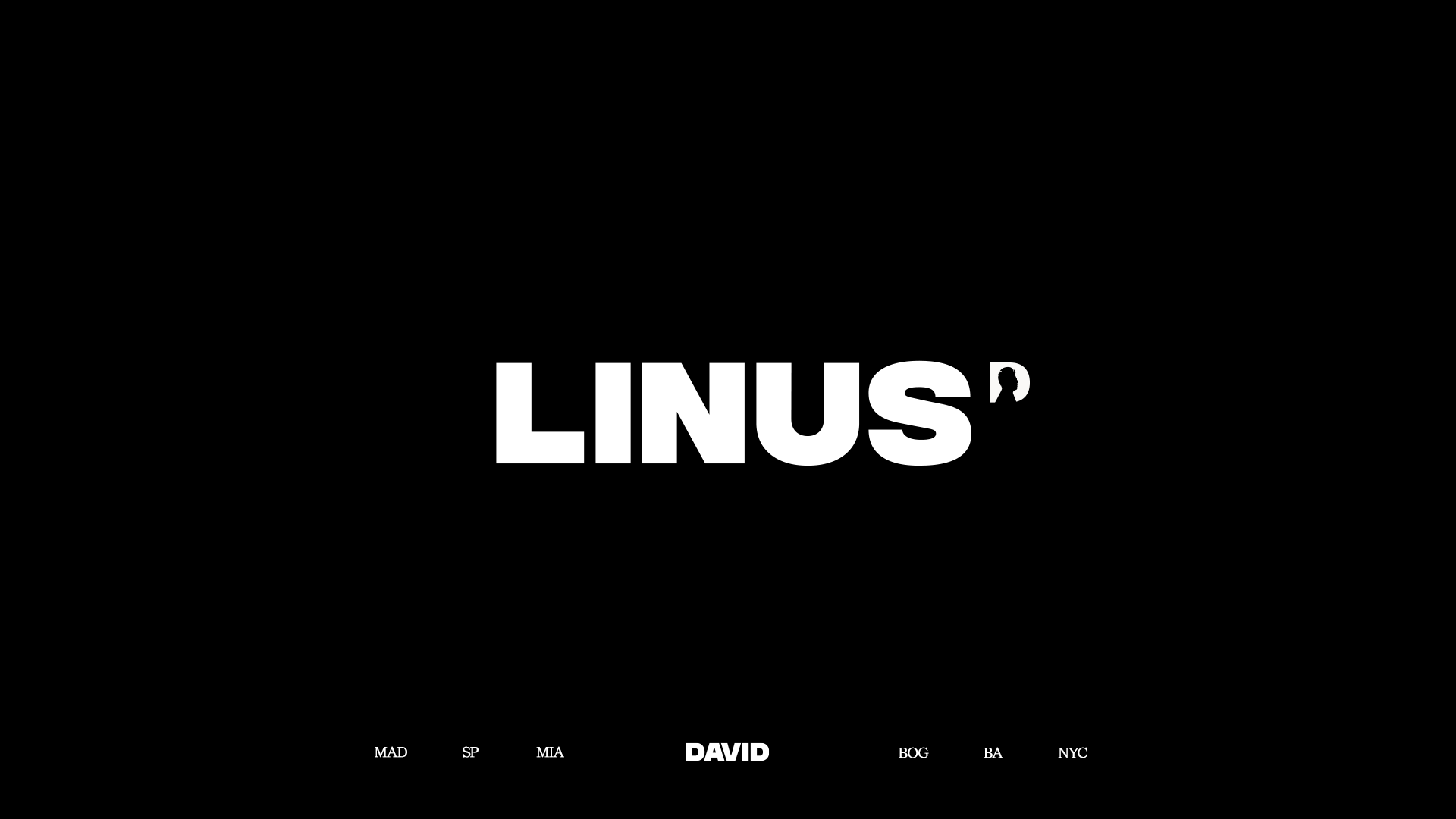
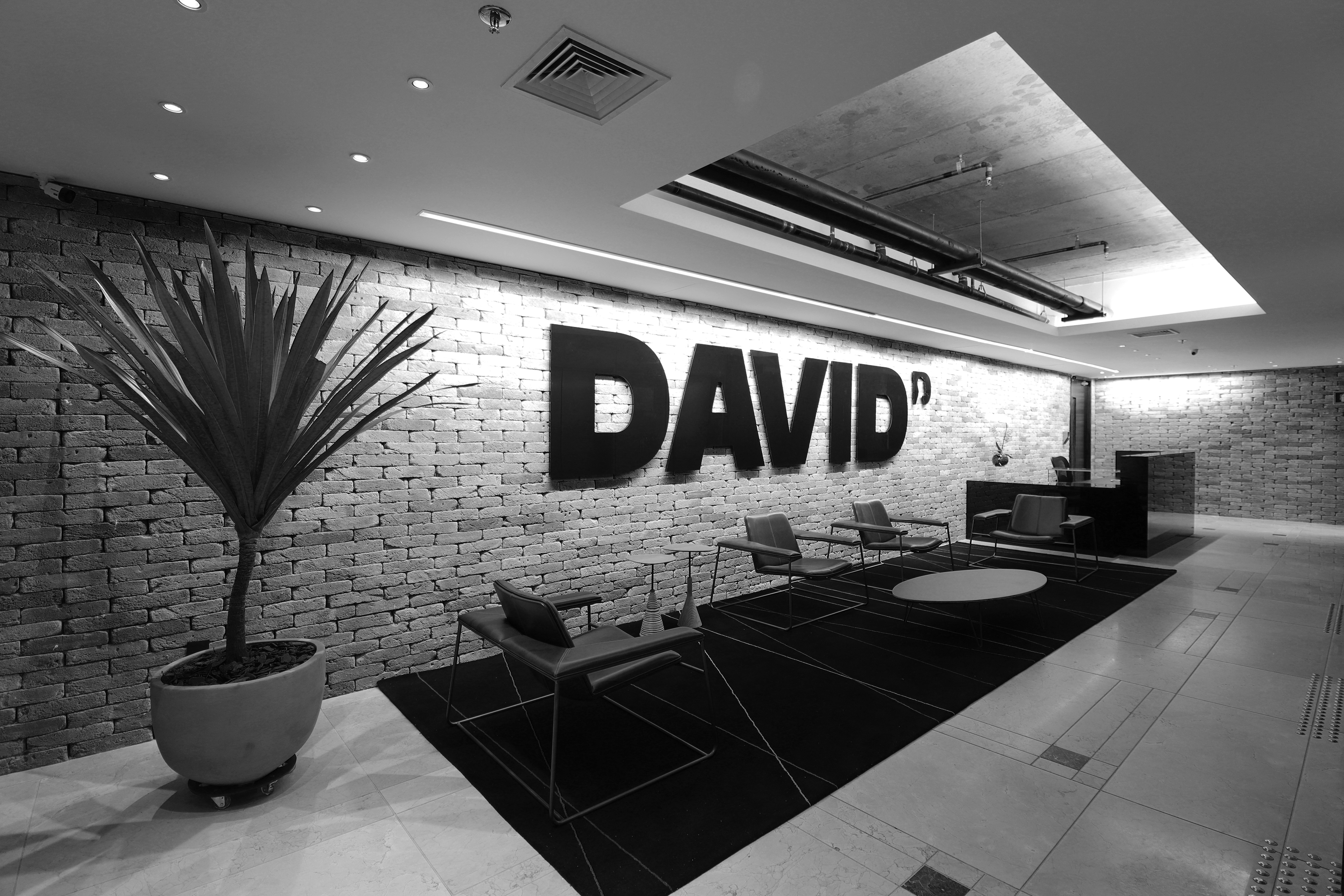
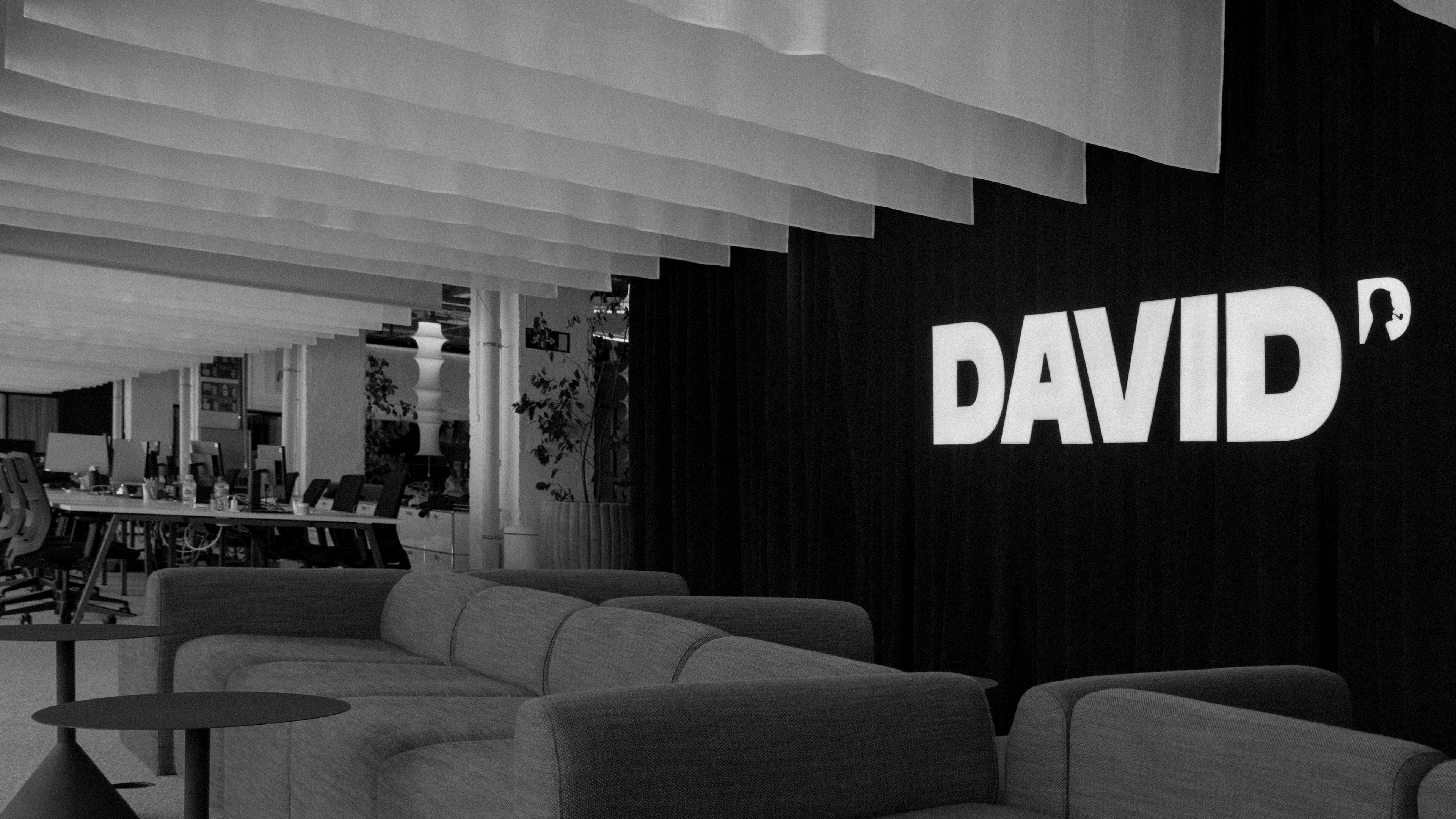
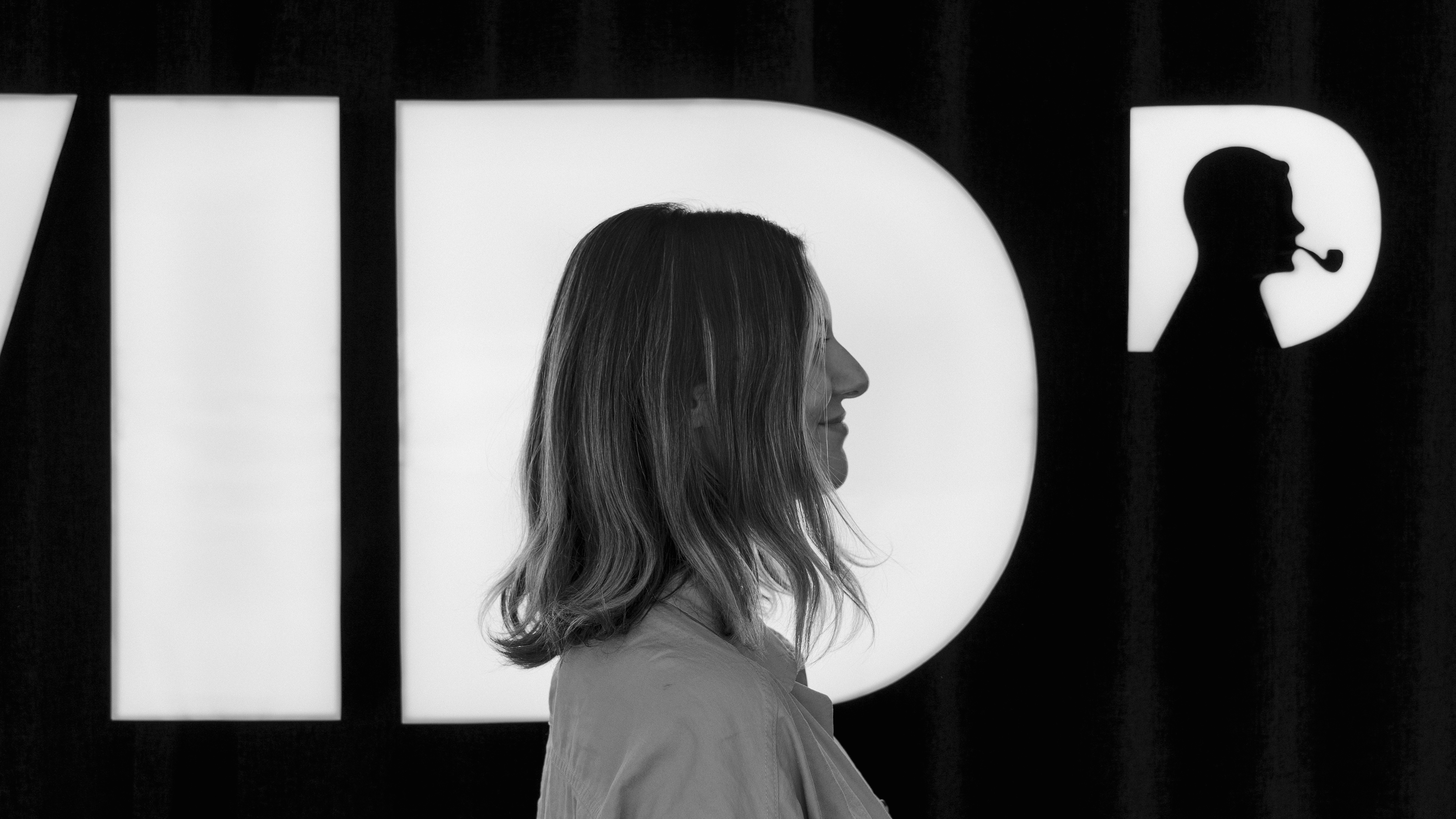
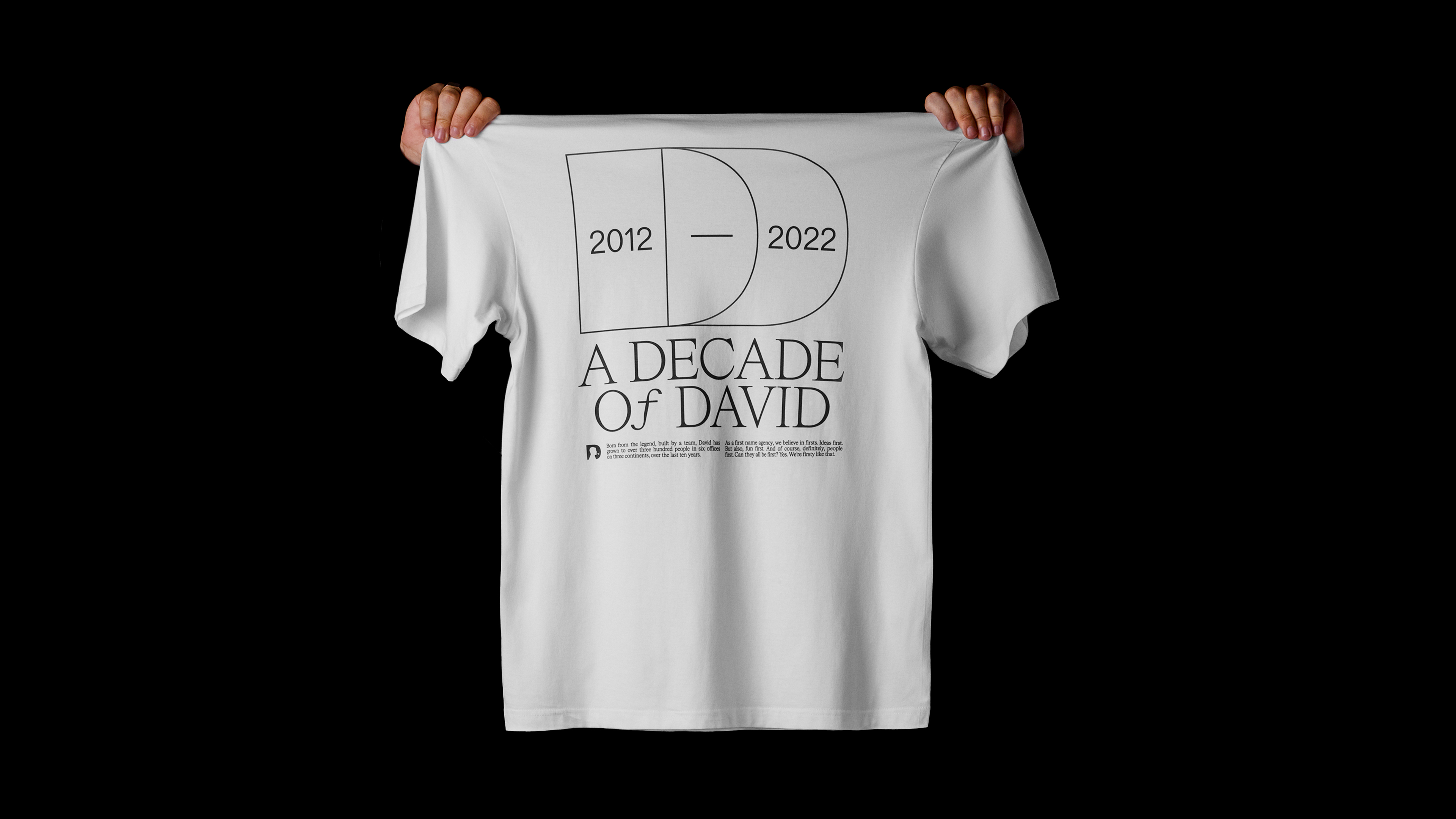
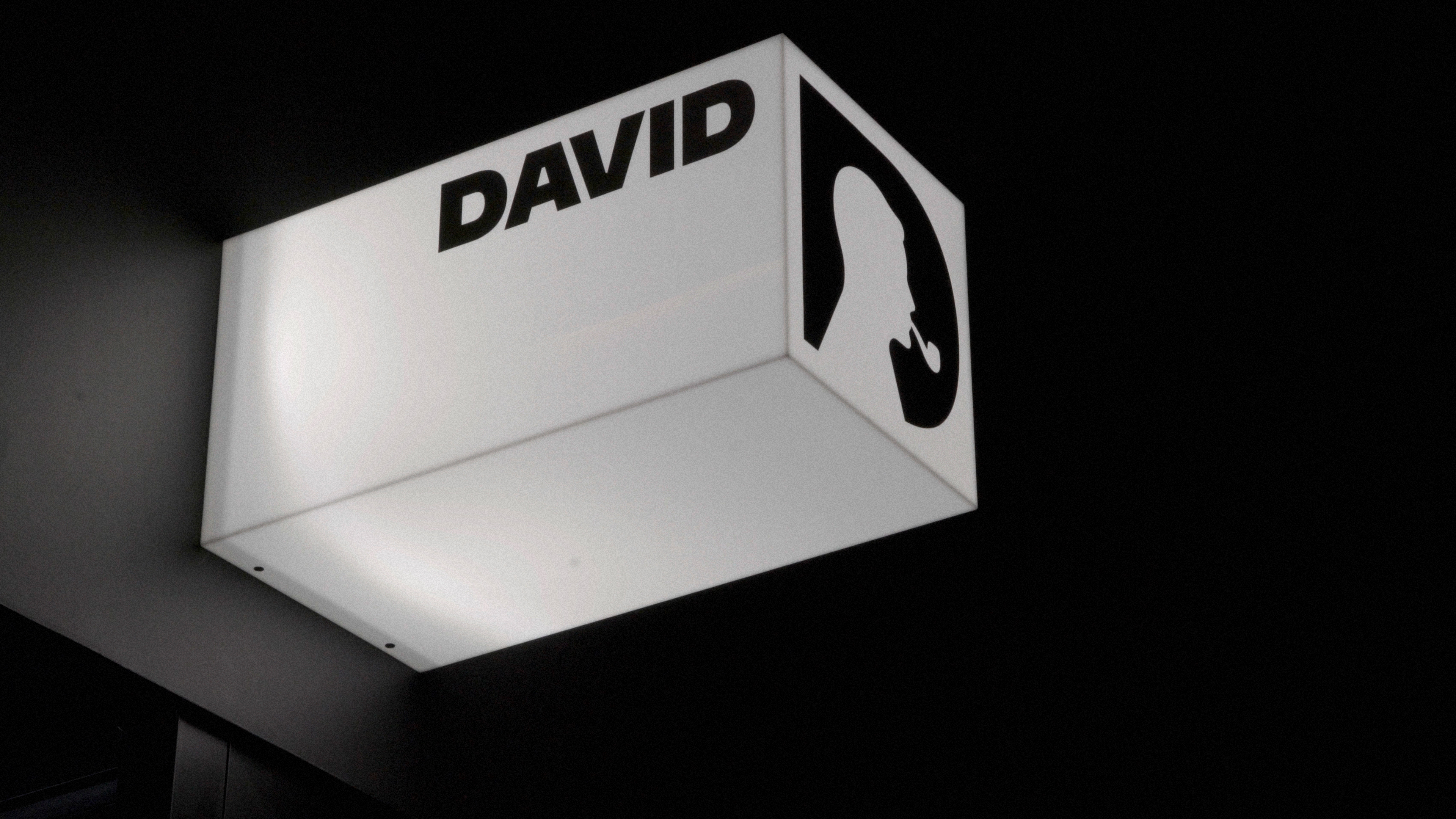
Four hundred people, almost thirty different nationalities. That's the melting pot that makes DAVID a diverse and special place to be. To celebrate its 10th anniversary, we created a new visual identity with a bolder logo that continues to pay tribute to David Ogilvy, but also celebrates the people who make the agency one of the world's most creative companies.
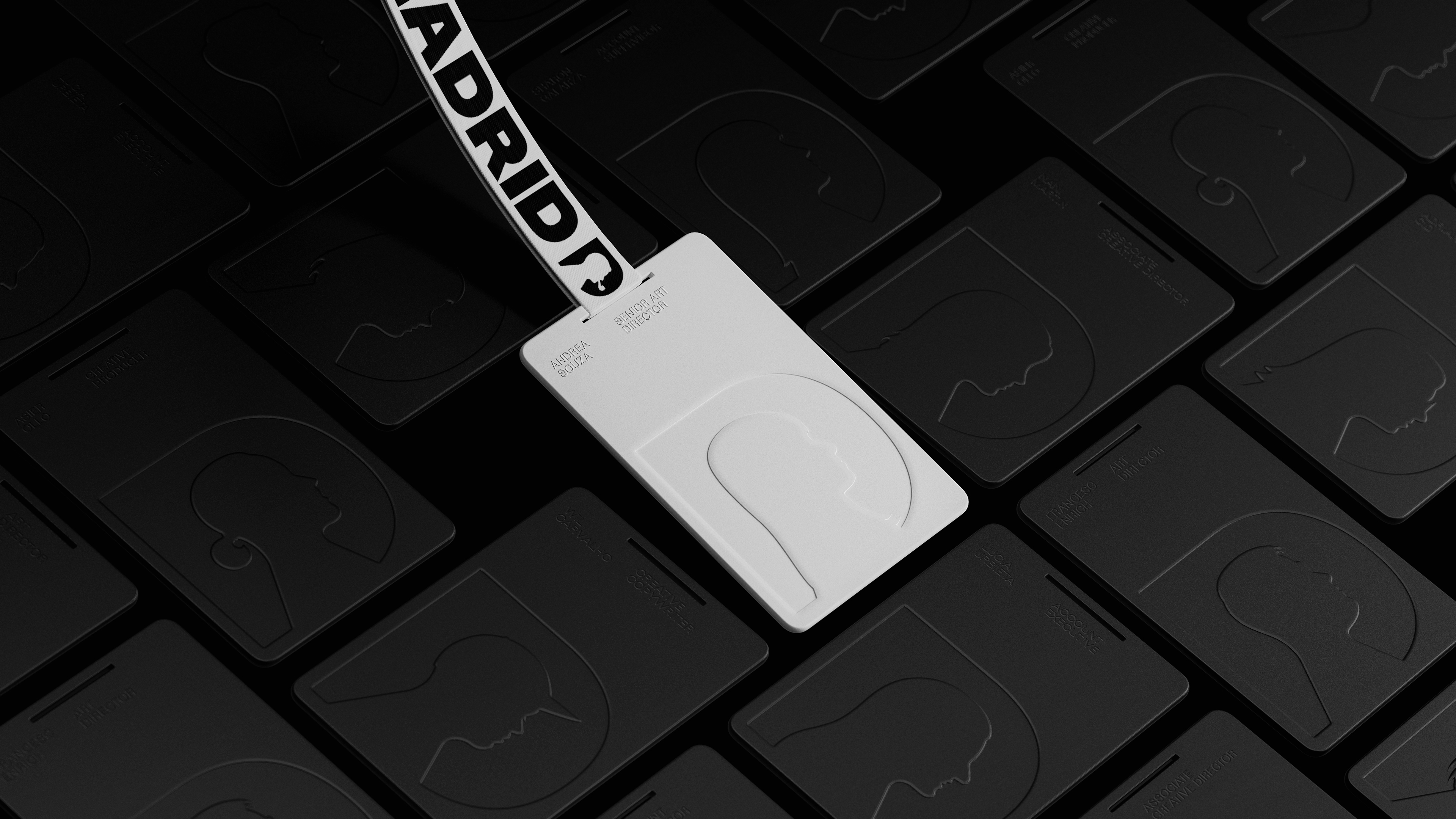
The refreshed identity is based on a series of 350+ handcrafted illustrations and serves as a custom tool so that each team member can use their own profile as the logo.
The refreshed identity is based on a series of 350+ handcrafted illustrations and serves as a custom tool so that each team member can use their own profile as the logo.
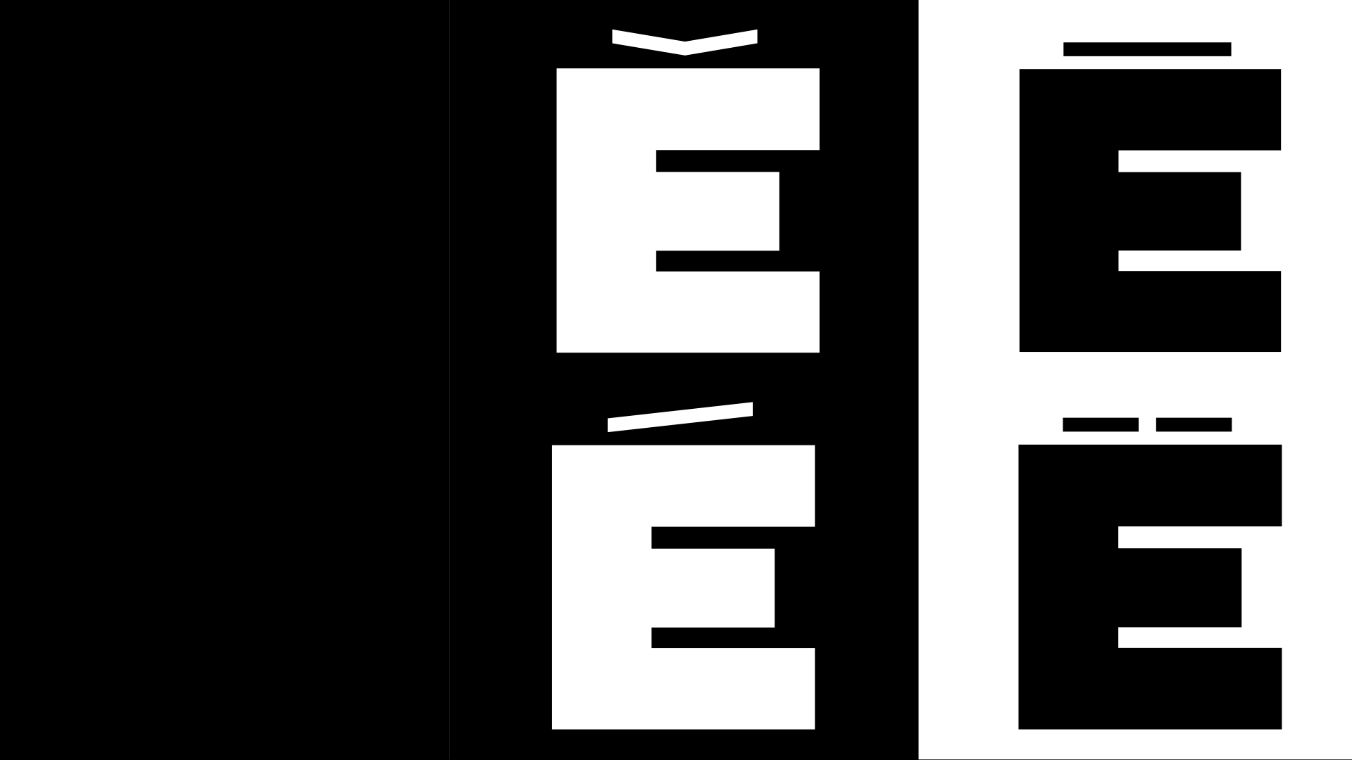
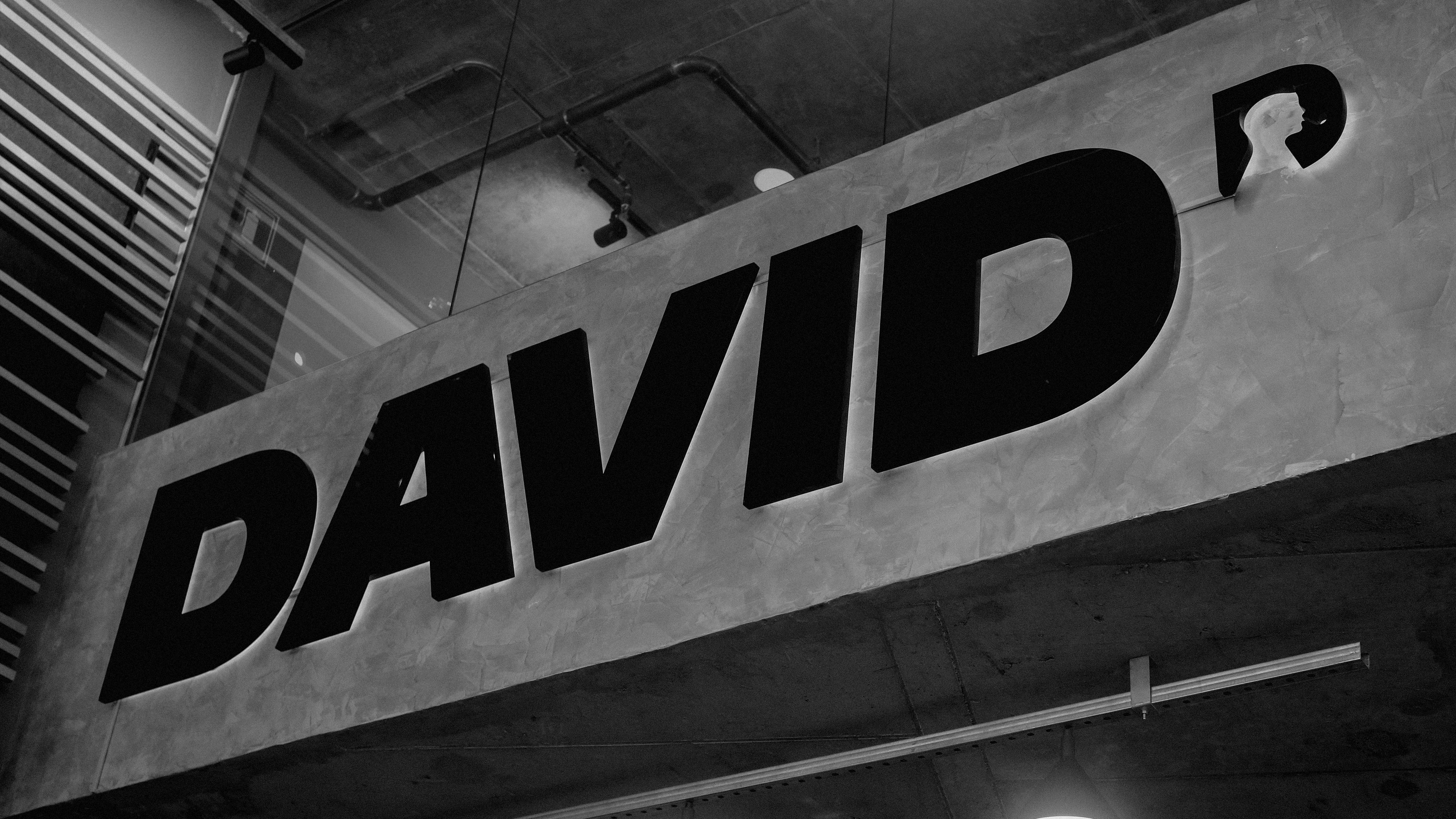
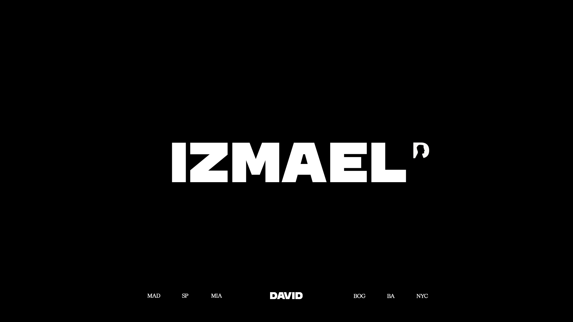
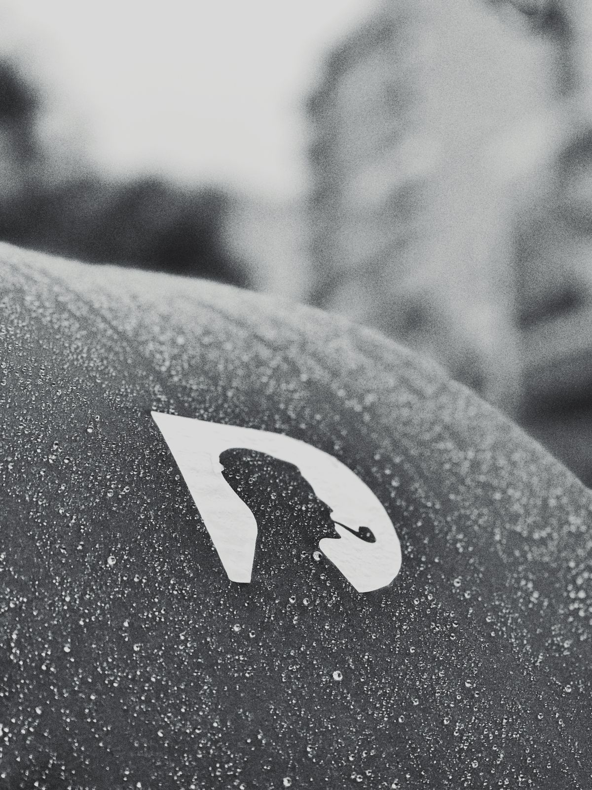
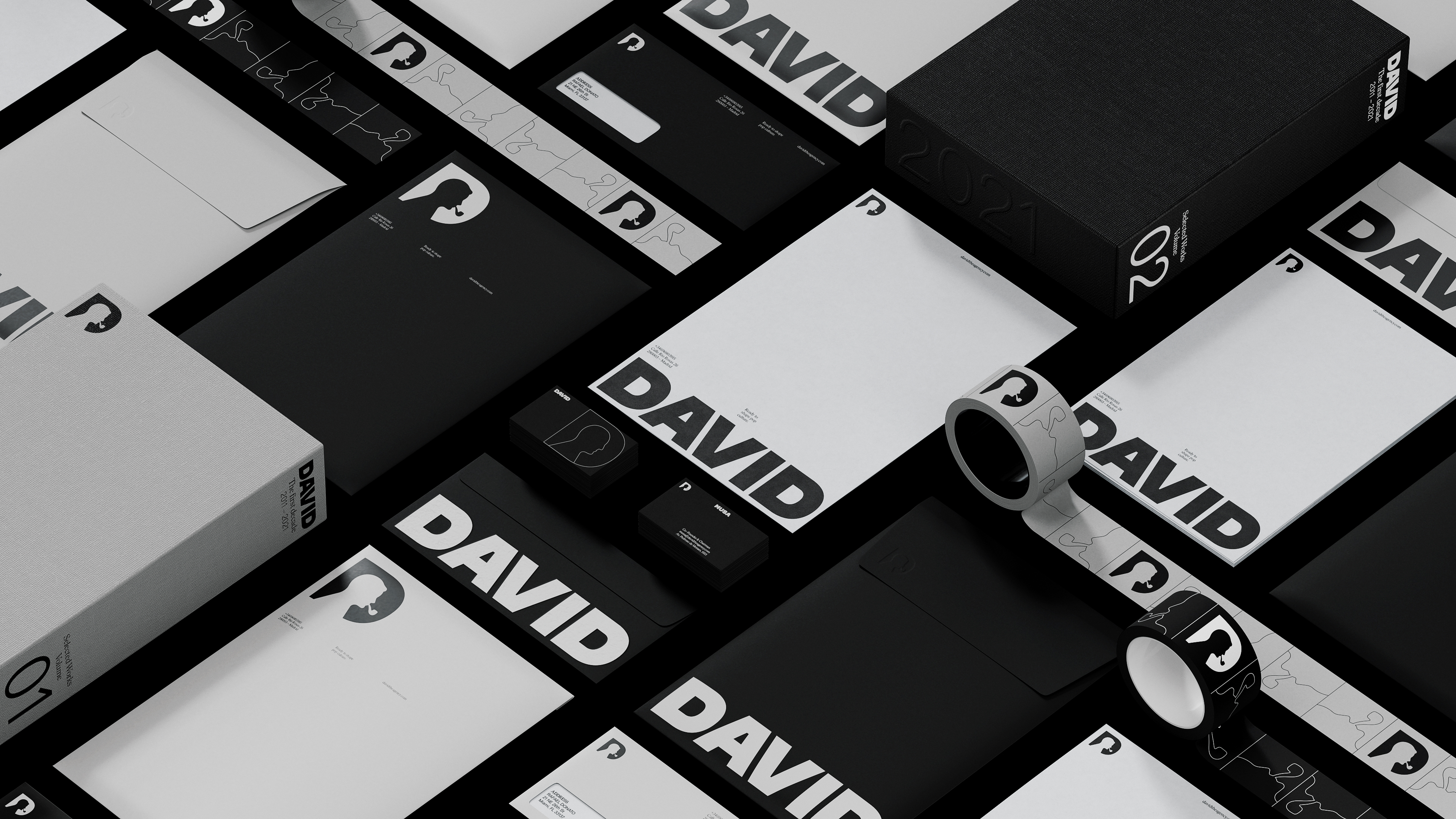
The new visual identity brings the letter D in the primary custom made font type DAVID Headline, with the figure of David Ogilvy at the center. The secondary typography has been replaced with HW Cigars.
This new visual identity will be on everything from email signatures to reconstructed office layouts, as DAVID welcomes a hybrid work model.
This new visual identity will be on everything from email signatures to reconstructed office layouts, as DAVID welcomes a hybrid work model.
01—
Design Idea
Design Idea
02—
Case Study
Case Study
03—
350+ Personalized Logo Versions
350+ Personalized Logo Versions
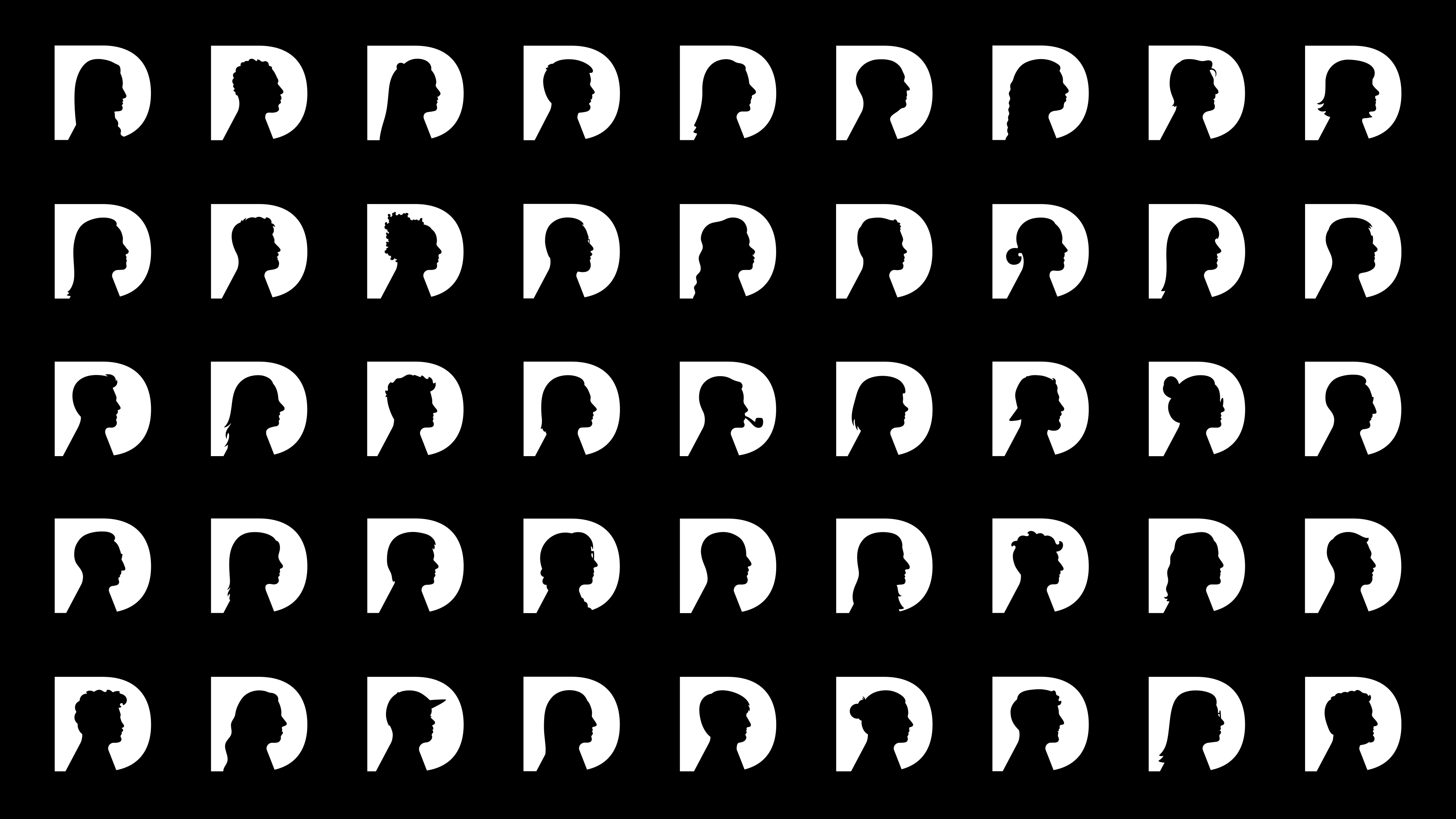
350+ versions of a logo. A rebrand that multiplies itself to represent every single talented person that makes DAVID what it is.
04—
Graphic Design
Graphic Design

David celebrates a decade with a new identity and a look ahead.
Adweek —
Adweek —
05—
Light Box Lettering
Light Box Lettering
06—
Visuals
Visuals
07—
Graphic Design
Graphic Design


As a tribute to its people, DAVID’s new design reinvents the iconic image of David Ogilvy together with each and every member of the company.
Adlatina —
Adlatina —
08—
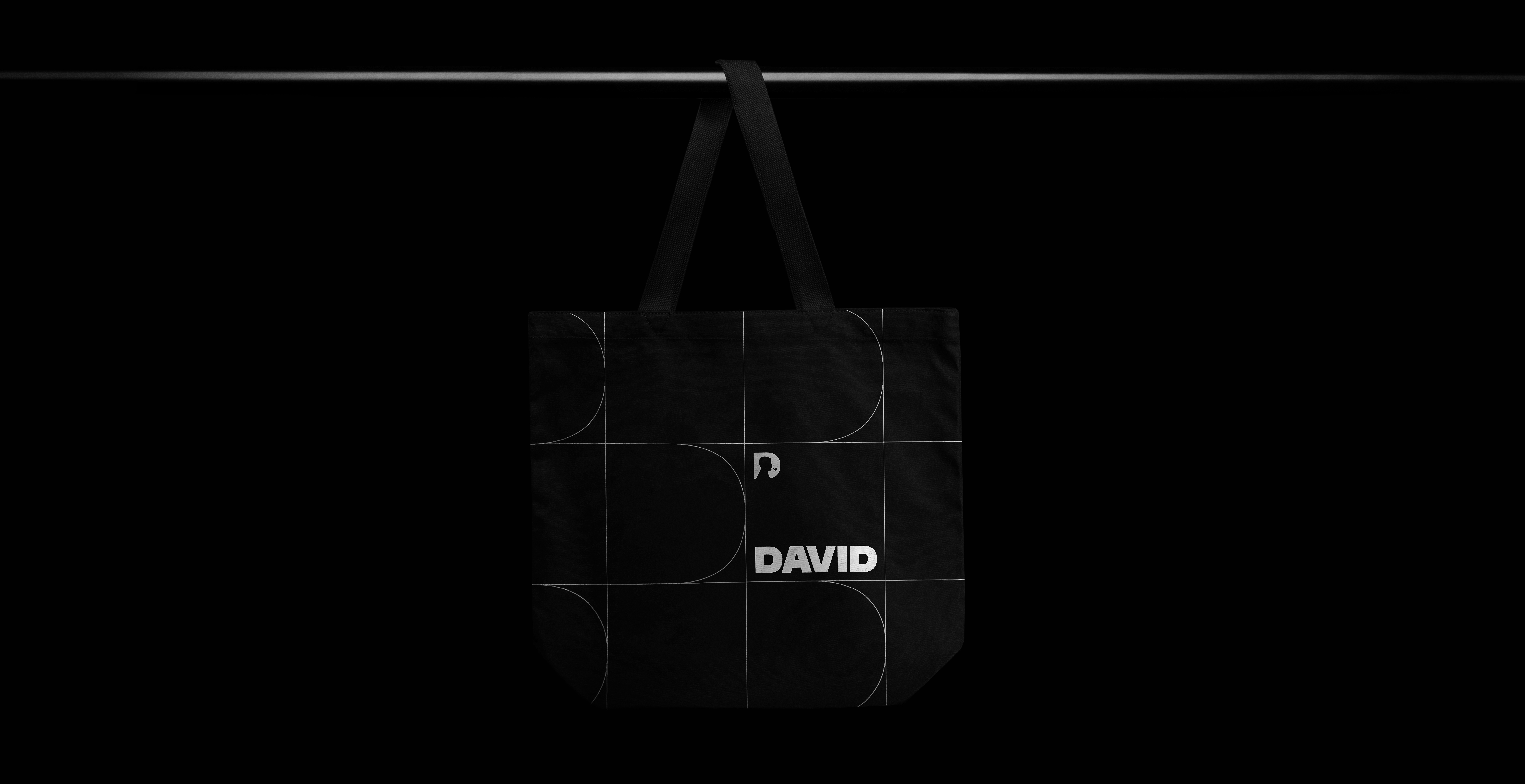
Tote Bag
Tote Bag
09—
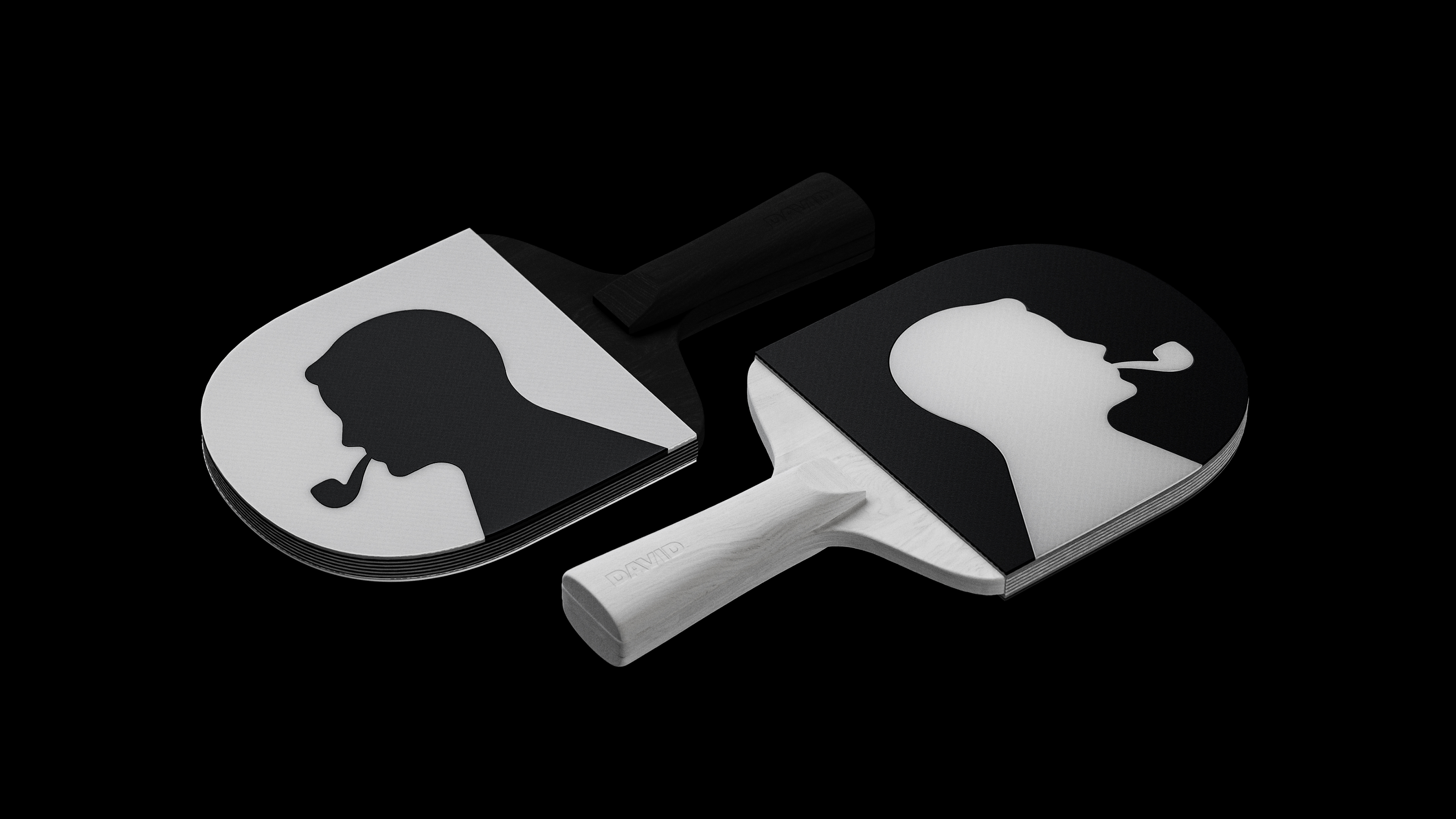
Ping Pong Rackets
Ping Pong Rackets
10—
DAVID Headline Typography
DAVID Headline Typography